

Story
Work
web design, print design, writing, code, interior design, and so much more.
Technology
1.0 HTML/JS
2.0 HTML/JS/Expression Engine
3.0 HTML/JS/Expression Engine
4.0 HTML/JS/Expression Engine
5.0 Framer
fangr
The goal for our identity: mesh German design with NYC style. Black, red, gold meets subway. We added an inverse red to rule out overly patriotic impressions.
Sadly, that’s turquoise.
Palette
Red
Grey
Dark
White
Yellow
Turquoise
Type
Neue Grtesk Medium
Neue Grtesk Light
over the years, we’ve discovered new ways to make our mark.
enjy.
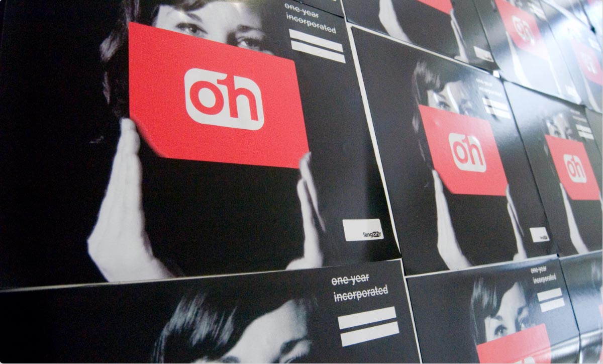
One year in.
Fridge magnet puzzle for the ffice 2.0 opening party.
It’s , not ho.
Please double-check your spelling.
We set up the website fanghor.com to guide lost souls (or simply those who made a typo) back at all hours.

Carls Ancalmo,
color-coordinated.


Promotional material 01:
brchure.
Dollar bill dimensions →
Custom designed stamps →
Money collector envelope →
Pricey UV varnish print →
Costly recycled paper →
Sent out to hundreds →
2 replies →
1 ecstatic.
What else do you need?

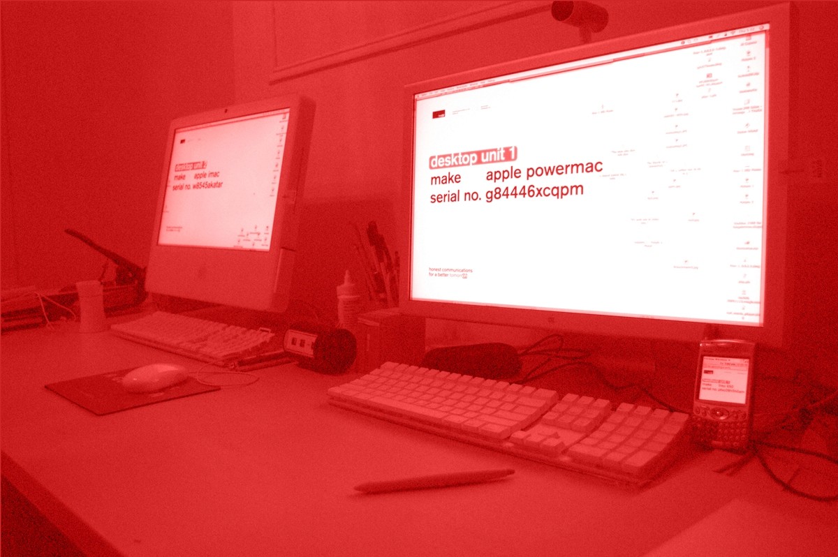
From keyboards to coffee mugs to bundles of wires, our third run of cards displayed what was on our desks.
We waited until the work surface took on the characteristic of its owner until we framed it.


Aerial view of our office in 1:25.
Somehow, we love moving.
Privacy stripes ≠ Uncommon Projects
Our old homepage let you make a mess of our ffice.
(For the eagle-eyed: We had Ikea before we had Eames chairs. We’re self made.)
Our hliday screensaver.
We’re still not tired of it.
The labratory opens.
We took our timeline for a spin through space.
We build apps on Fridays.
This is ptions.com.
If we were compatible you’d receive a studio discount, but push ‘Clubbing Seals’ and ‘Oil Money’ and the app would tell you to get off our site.
Launched around the time Survey Monkey did, ptions was open to anyone to create their quizzes or surveys.

We have an actual (silly) trademark—
Of course we do.

Look left. Look right. Then swipe:
pingpng.com
Our table tennis app keeps track of every game and calculates a global high score.
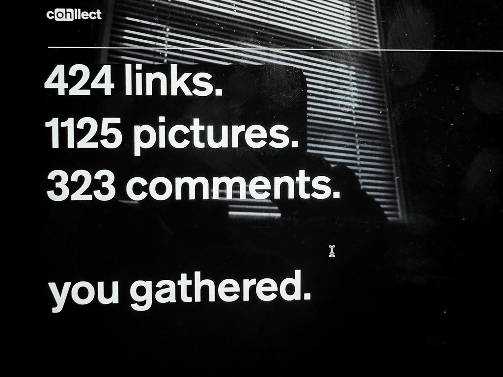
cllect.com was our inspiration site and browser plug-in.
It was launched right around the time Pinterest did.
Notice a pattern?


Studio view ntes:
if this looks serene, add the sound of steel trains shaking the bridges at all hours in your mind.
the e.p.a. boat circles the island of manhattan twice a day. somehow, it lifted chins and the mood every time.
in heavy rain, the bridge looks like a steam punk dinosaur being lifted from the river with waterfalls coming off both sites.
Sad, but this view is no more.
It made room for condos.


When the Berthold foundry wanted close to $10k to embed Akzidenz Grotesk, our old house typeface, into our site, we decided to design our own instead.
Hallo, neue grtesk.

today,
tomorrw.
we aim to communicate what’s important:
honesty, making the world a better place, relentlessly playing through the details to create products that are lasting and useful.
nward.